ABOUT
DARK EARTH
Dark Earth is an independent brand design studio dedicated to empowering emerging bands and businesses, along with those developing their side hustles. I understand the unique grind involved in building something truly your own, often outside of normal hours, and the challenge of balancing that with daily life.I offer collaboration on everything from individual design projects to full visual identities, always backed by a solid brand strategy.
BRANDING DESIGN
Your brand is more than just a logo; it's the visual representation of your music or business. We will work together to craft an identity that captures who you are.Brand Strategy
Logo and Icon Design
Brand Guidelines
Colours and Typography
Image and Video editing
PACKAGING DESIGN
Your packaging needs to capture attention across all formats, from physical items on the shelves to the scroll of playlists and product pages online.Album & EP Art Direction
Physical Packaging Layouts
Digital Release Assets
Special Editions
Product Packaging
GRAPHIC DESIGN
Taking your brand and products further through promotions and items that help your audience show their allegiance and spread the word.Merchandise Design
Posters & Flyers
Social Media Graphics
Website Graphics & Banners
Promotional Materials
ABOUT ME
My name is Graham, and Dark Earth is my solo project. After growing up working in music retail, I've spent nearly half my life in digital marketing and display advertising. I created Dark Earth in October 2023 as a way to express myself through my own designs and focus more on branding.Music is a huge part of my life. When I'm not designing with my headphones on, you'll find me playing guitar (and drums when I can) or going to gigs. I'm also a huge NFL fan, having actively followed the Raiders since I was a kid. To find out more about me and Dark Earth, follow me on social media.
MUSIC
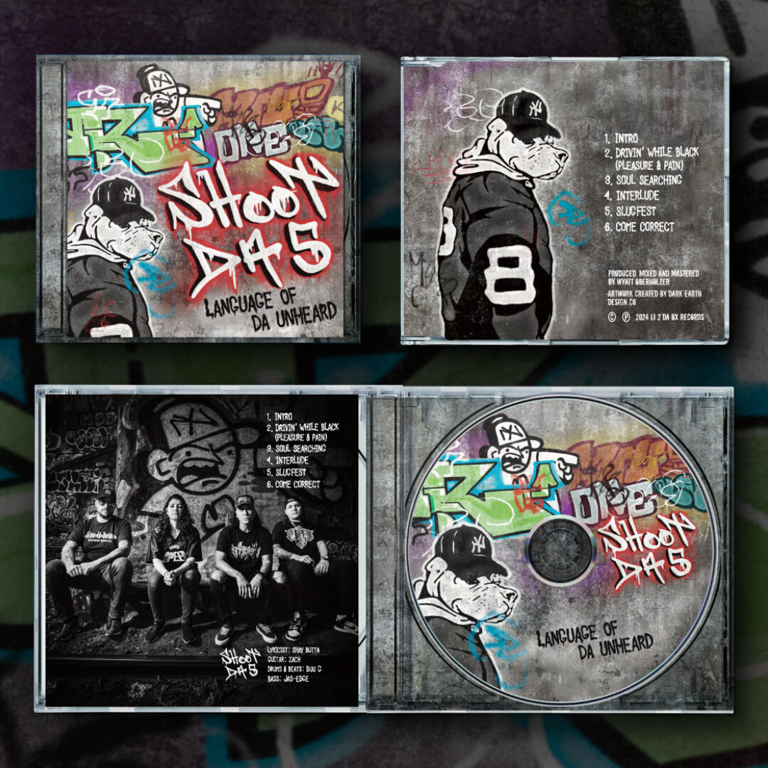
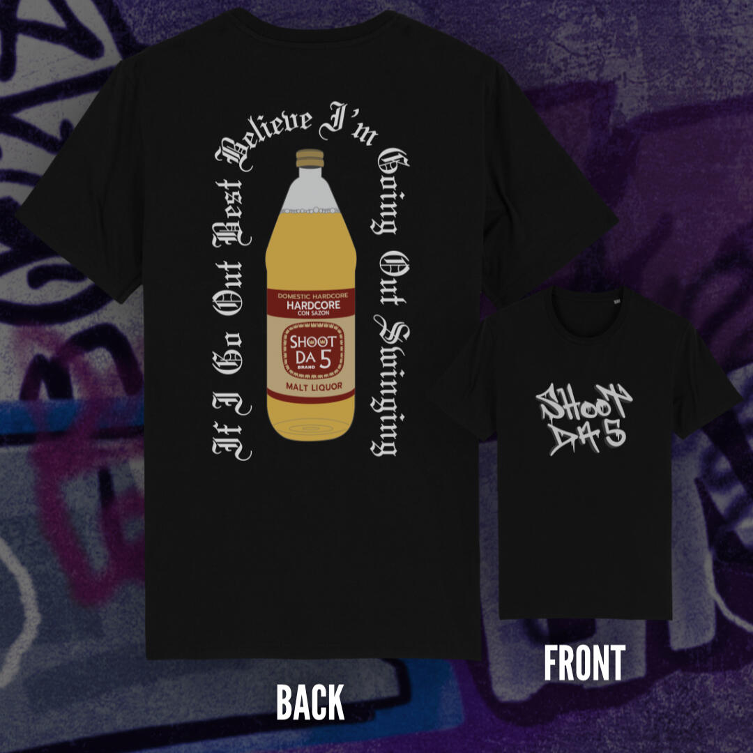
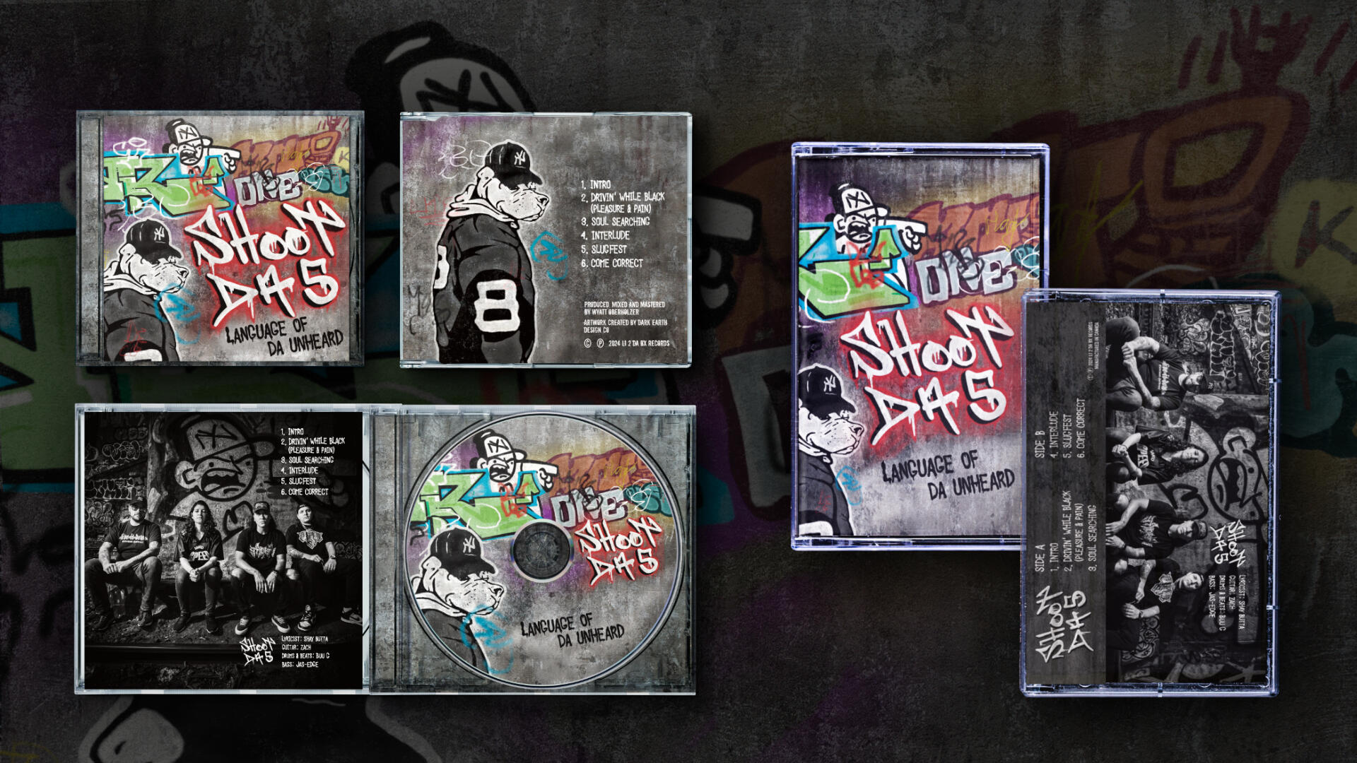
SHOOT DA 5
Illustration, Merch, Social Media
The cover artwork for the "Language of Da Unheard" EP was inspired by graffiti from the band's neighborhood, as well as some existing images. I redrew everything using a spraycan-style brush in Procreate to make it all look like it belonged together. I also used this technique to create the painted font on the cover and inside the CD case.I then adapted the artwork for use online, as well as on the CD and tape formats. I'm really proud of this project, and I'm so excited that it's not only available in the US, but it's also sold out in some independent stores in Japan! The EP is amazing and definitely worth a listen.
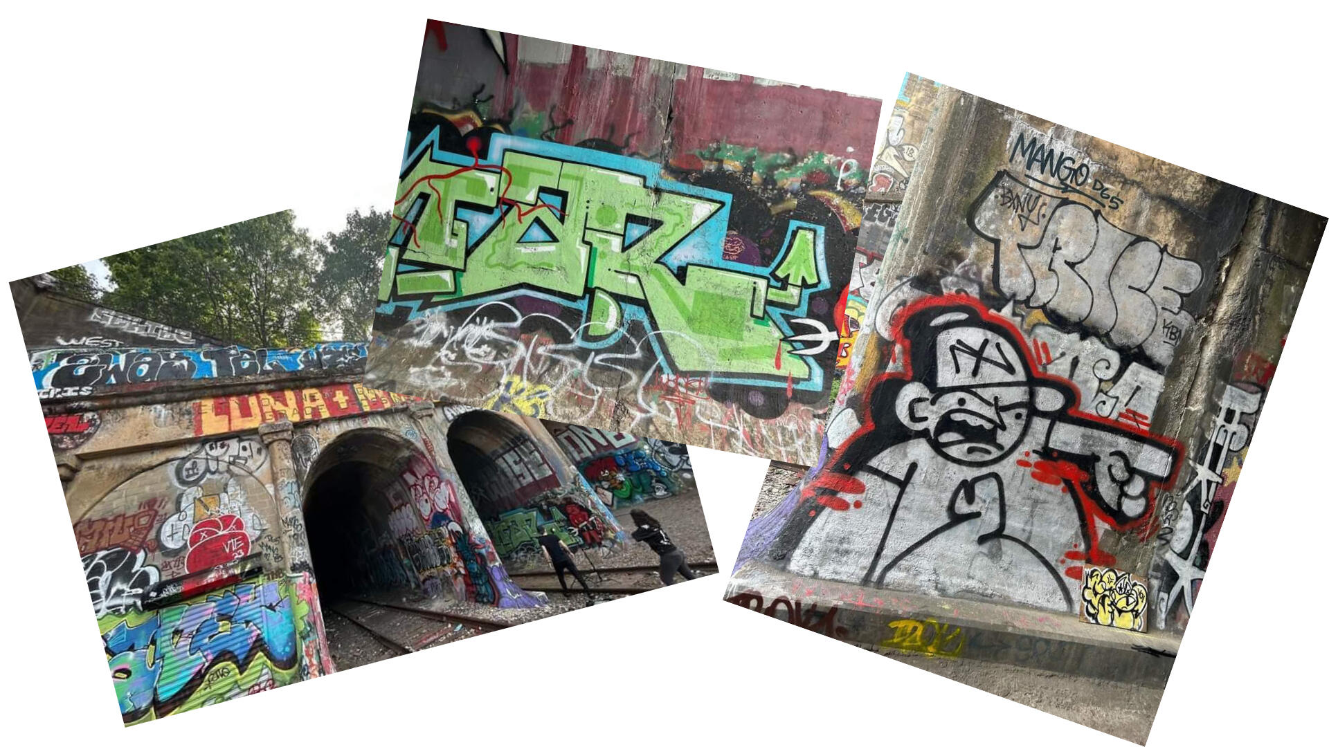
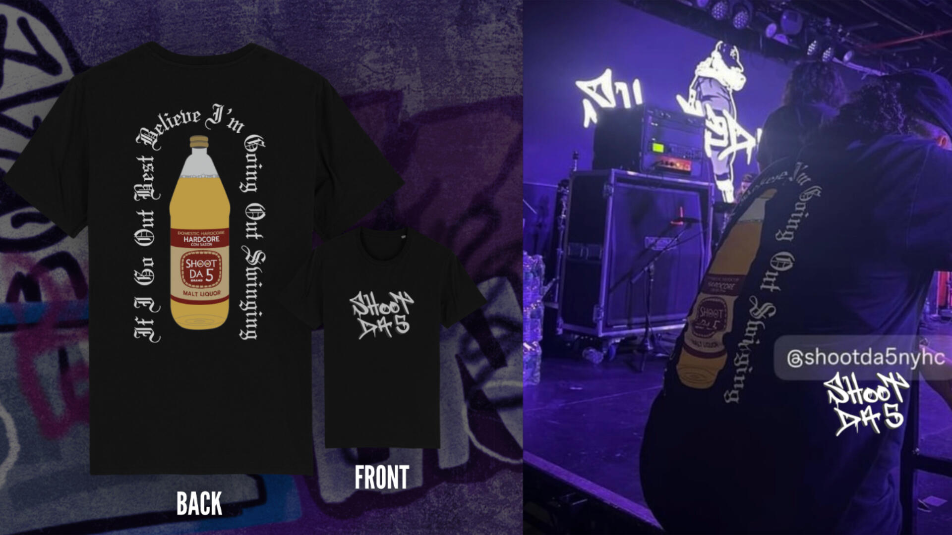
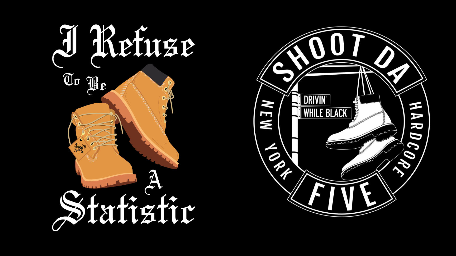
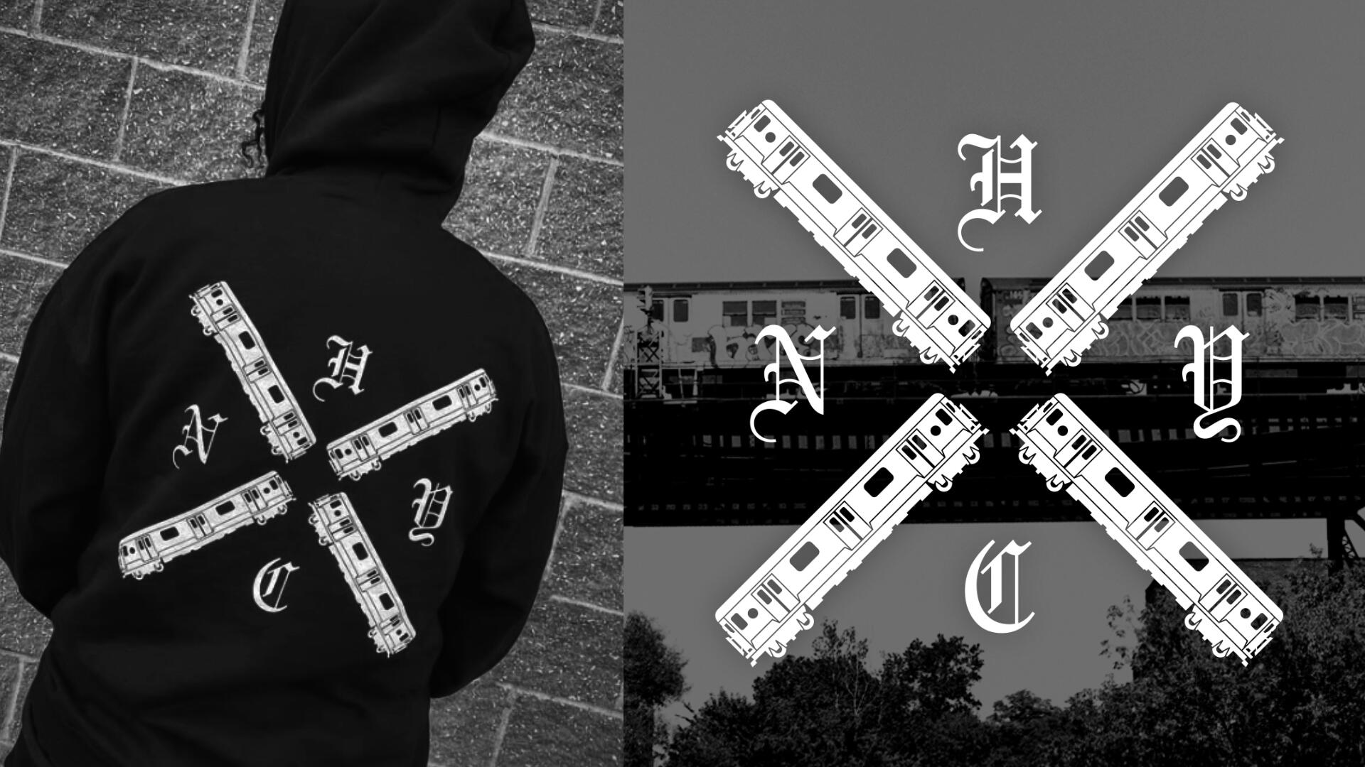
GRAPHICS
I made some new artwork using lyrics from the EP along with graphics that represent the band and the NY area. These included some updated versions of imagery the band already had, as well as some brand new illustrations. These have been used in promotional posts and for Merch releases.
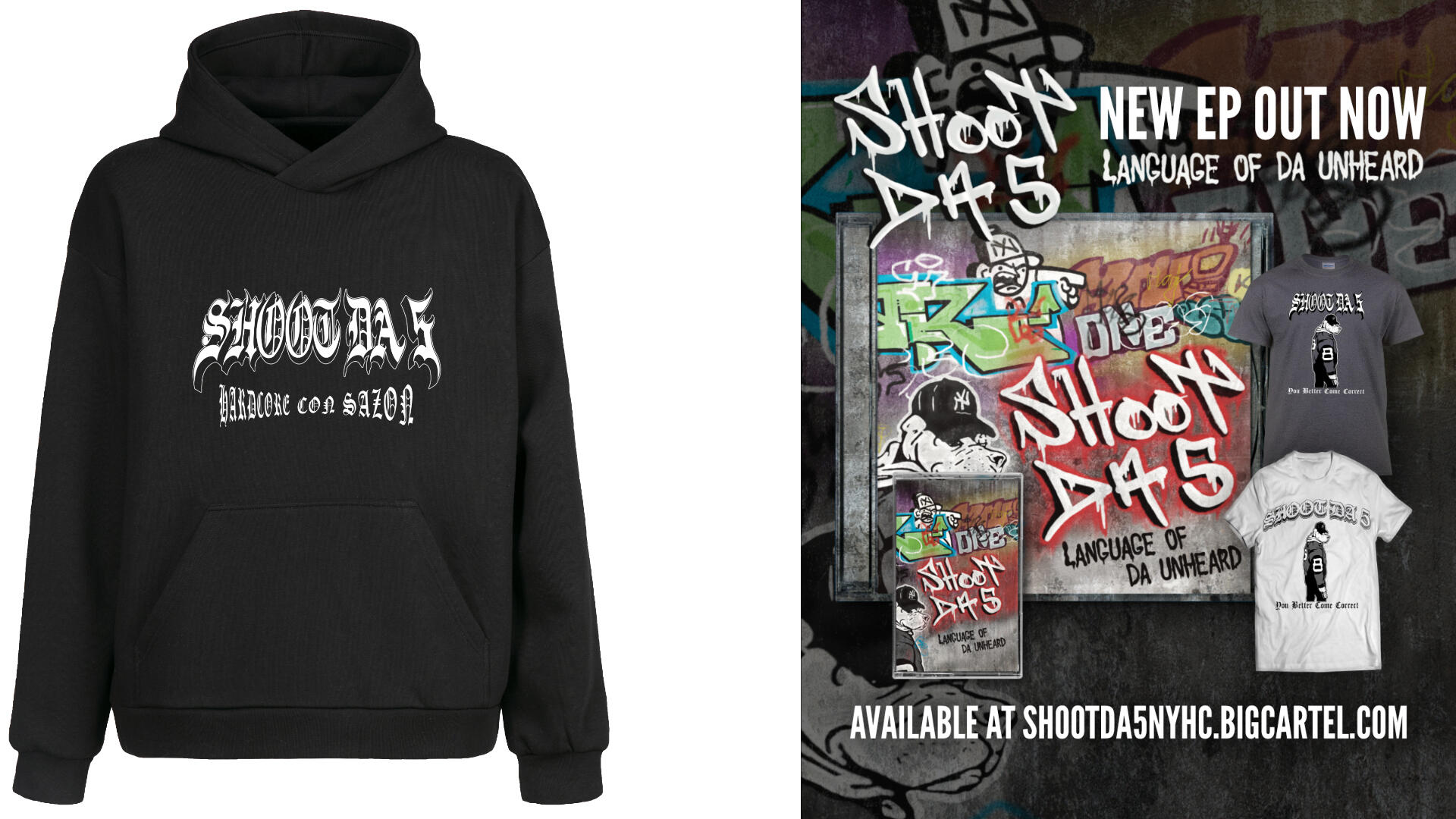
SOCIAL MEDIA
I've created some posts for Instagram and the band's online store to help promote the new EP and merch, including clothing mock-ups.I also edited a hard-hitting vertical video for the song "Driving While Black (Pleasure and Pain)" using historical and more recent footage. The band did a great job of researching and providing the footage, which made it easy to create a great video. I also made a different version of the video that can be used for paid ads.
ORIGINAL EDIT
ADVERT EDIT
MUSIC
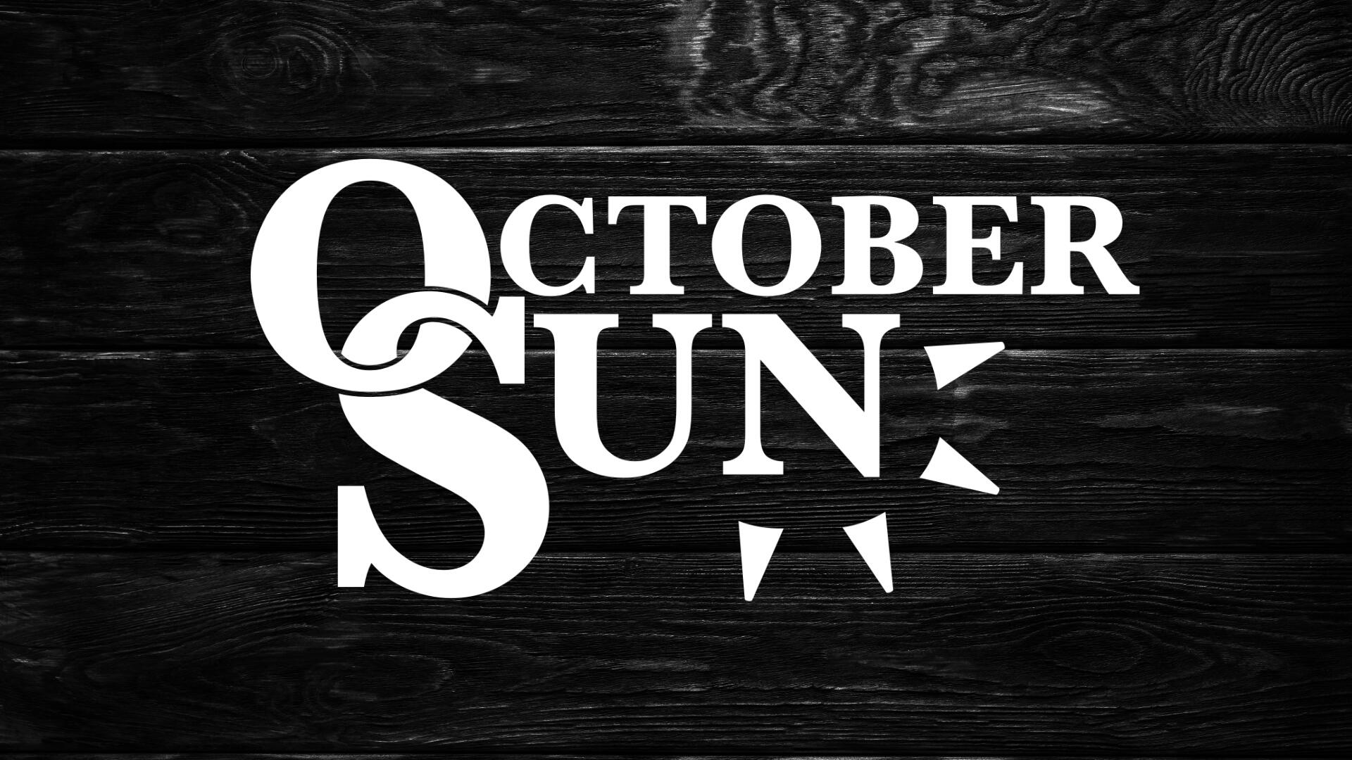
OCTOBER SUN
Logo Design
This logo design was for US-based Acoustic duo October Sun. Following some initial ideas supplied by the band, we took the logo through many variations using a preferred circle/sun concept. We settled on intertwining the first 2 letters (which can be used as a responsive icon) and adding the sun rays to give the logo a fun and more balanced feel.
MUSIC
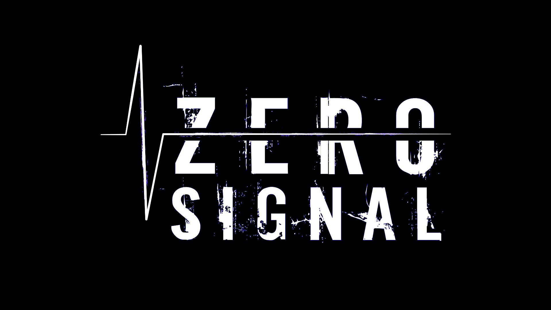
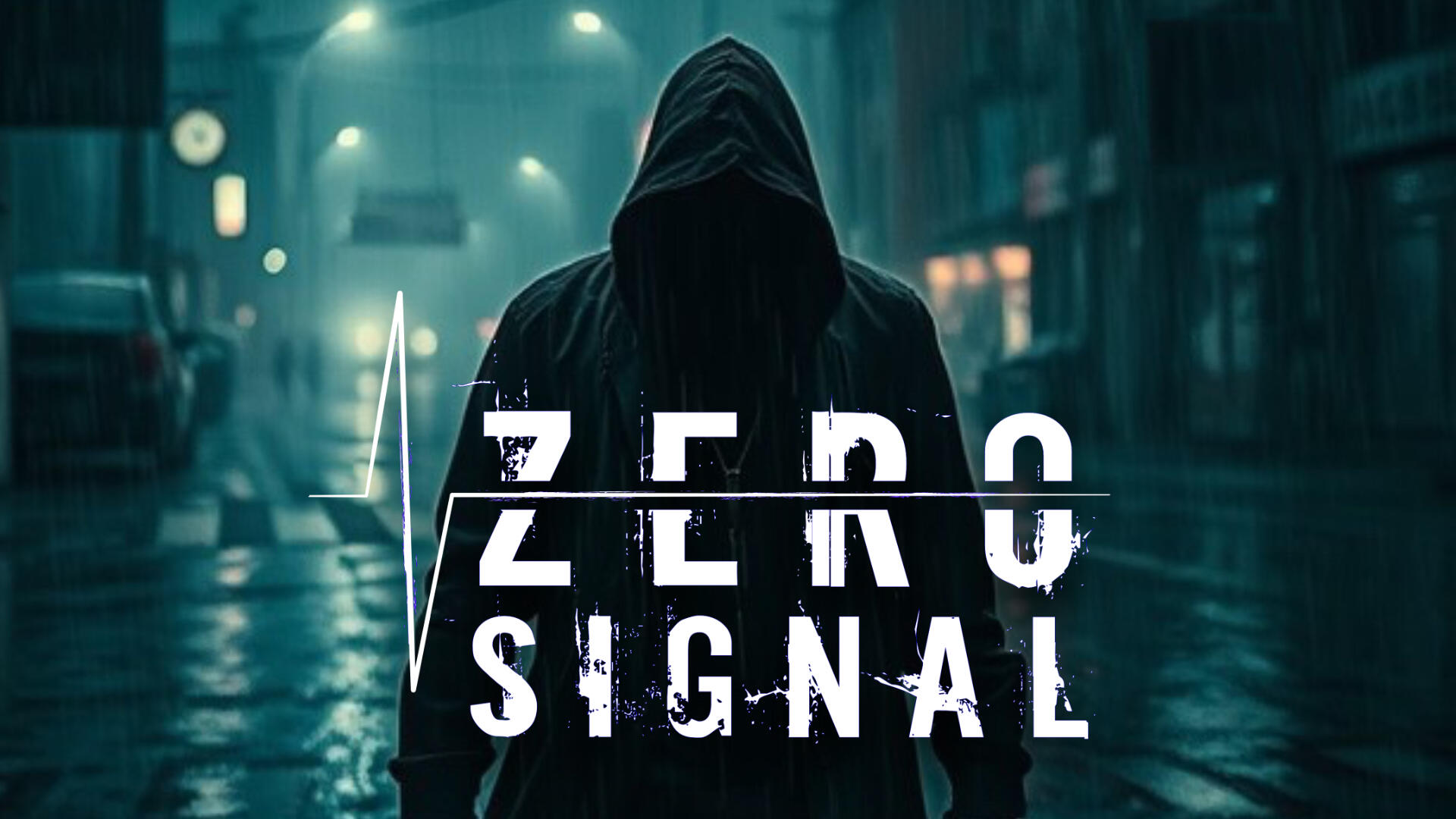
ZERO SIGNAL
Logo Design
This logo was created for industrial remix artist Zero Signal. We wanted to make sure it had a dirty, industrial feel with the font choice (which has some additional noise added to it) and then integrated this with the signal illustration.I tried using a waveform for this initially but the more solid line idea worked much better when logo was used in different sizes. Finally the colour choice was a reference to the Fear Factory album "Demanufacture", which contains the song of which the artist has taken his name from.
BLOG
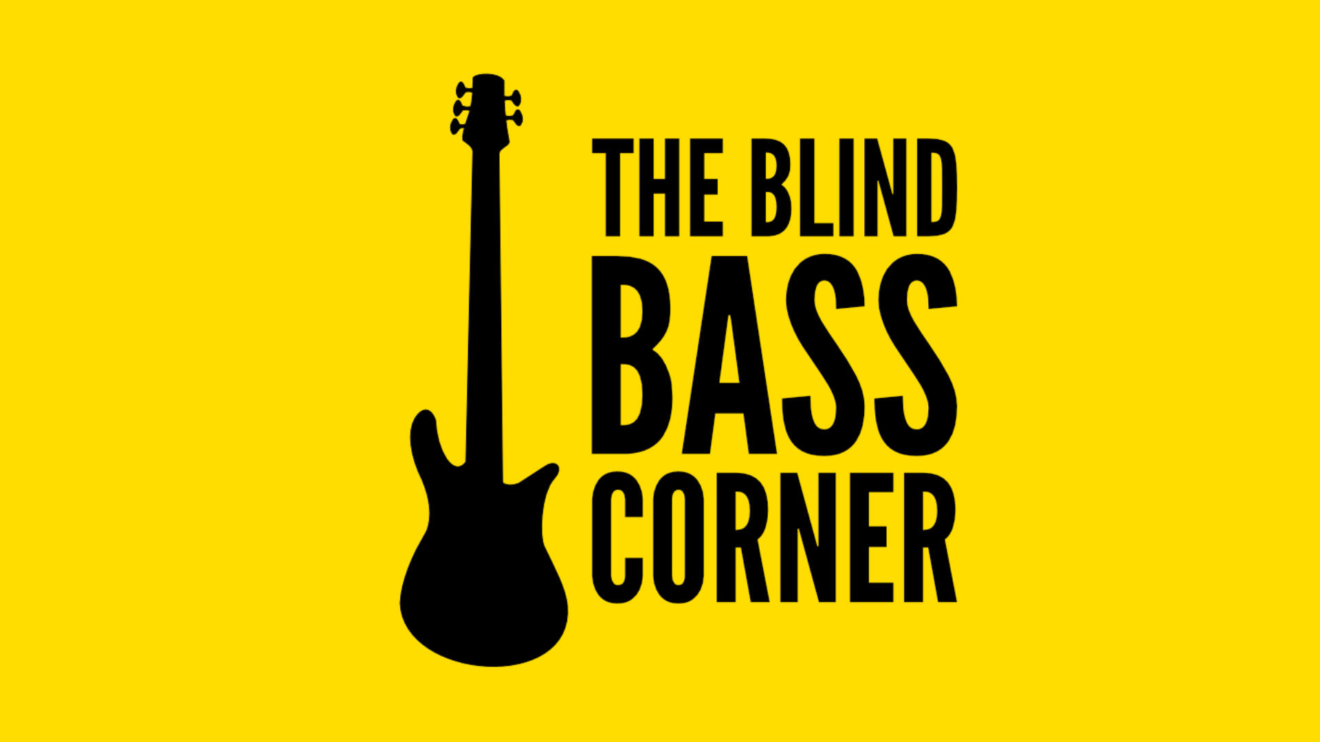
THE BLIND BASS CORNER
Logo Design
Designing this logo was really special. It's for my friend's blog – he's an awesome musician who happens to be blind. He wanted to create a space for other musicians with disabilities to connect and so that he could share content based on his own experiences to help others.The number one goal was to make sure the design was very accessible for those viewers with visual impairment. For this reason high contrast colours such as black and yellow were chosen.
GAMING
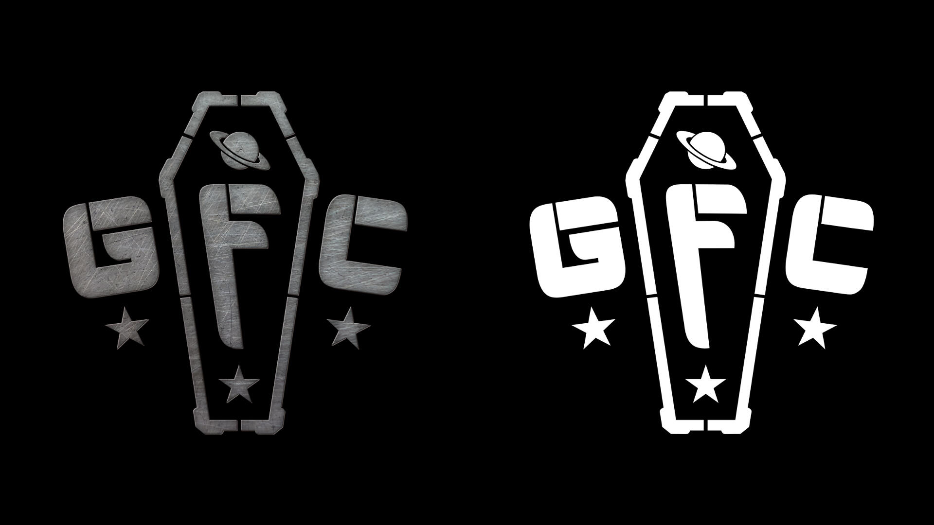
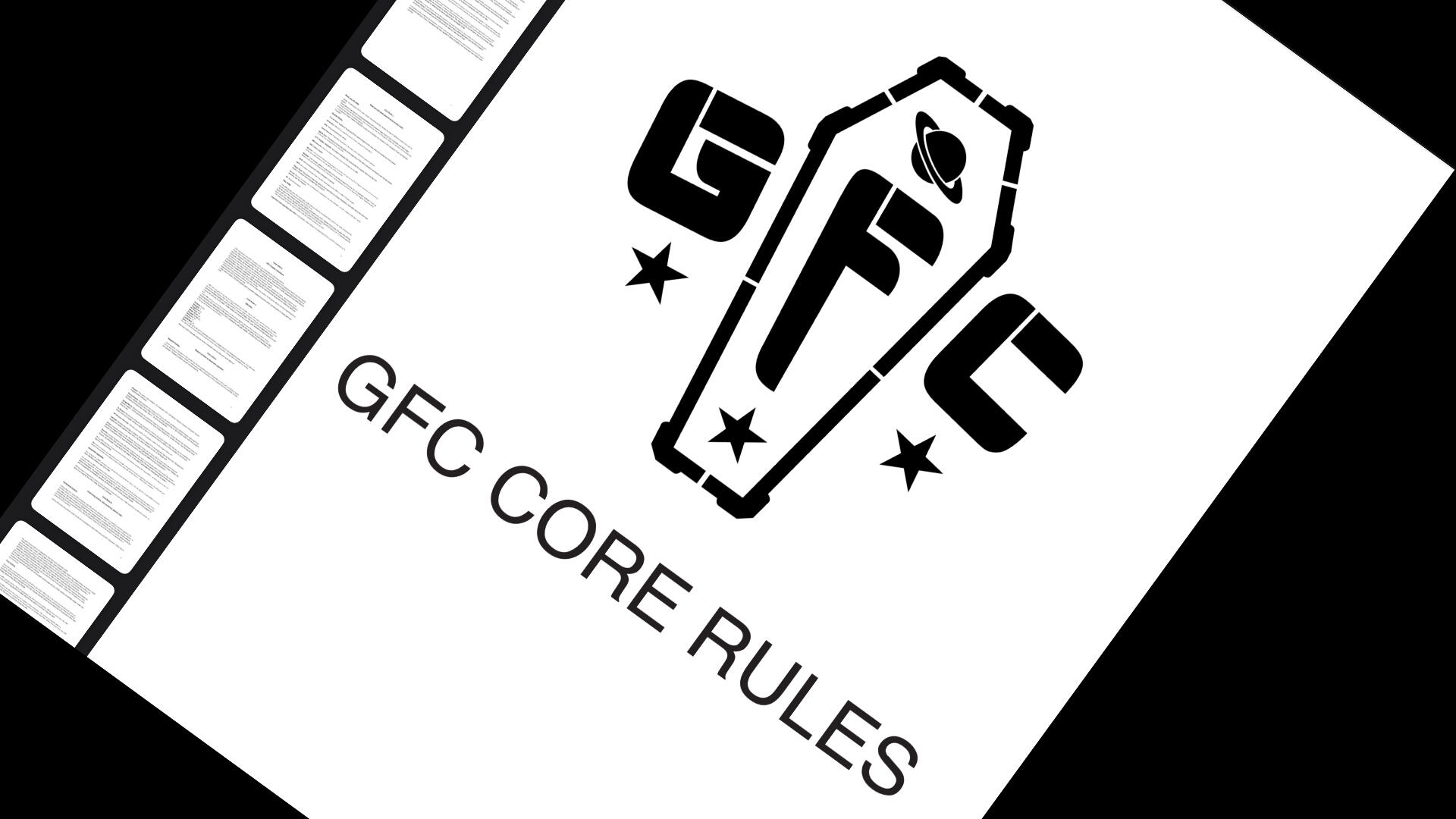
GALACTIC FLEET COMMANDOS
BRANDING, PDF SETUP
I was asked to design a logo and rulebook for a new role-playing game about a team of soldiers called the Galactic Fleet Commandos. The game is set in a far future universe, and I was given some ideas to work with, like space and the shape of a coffin. I combined those with a modern, tactical look and created flat and textured versions of the logo.The rulebook has a simple design with not too many images, which makes the file size smaller and also makes it easier for people to read. That was one of the most important things I was asked to do. The rules are still being tested, so it's also easier to make changes to the rulebook when needed.
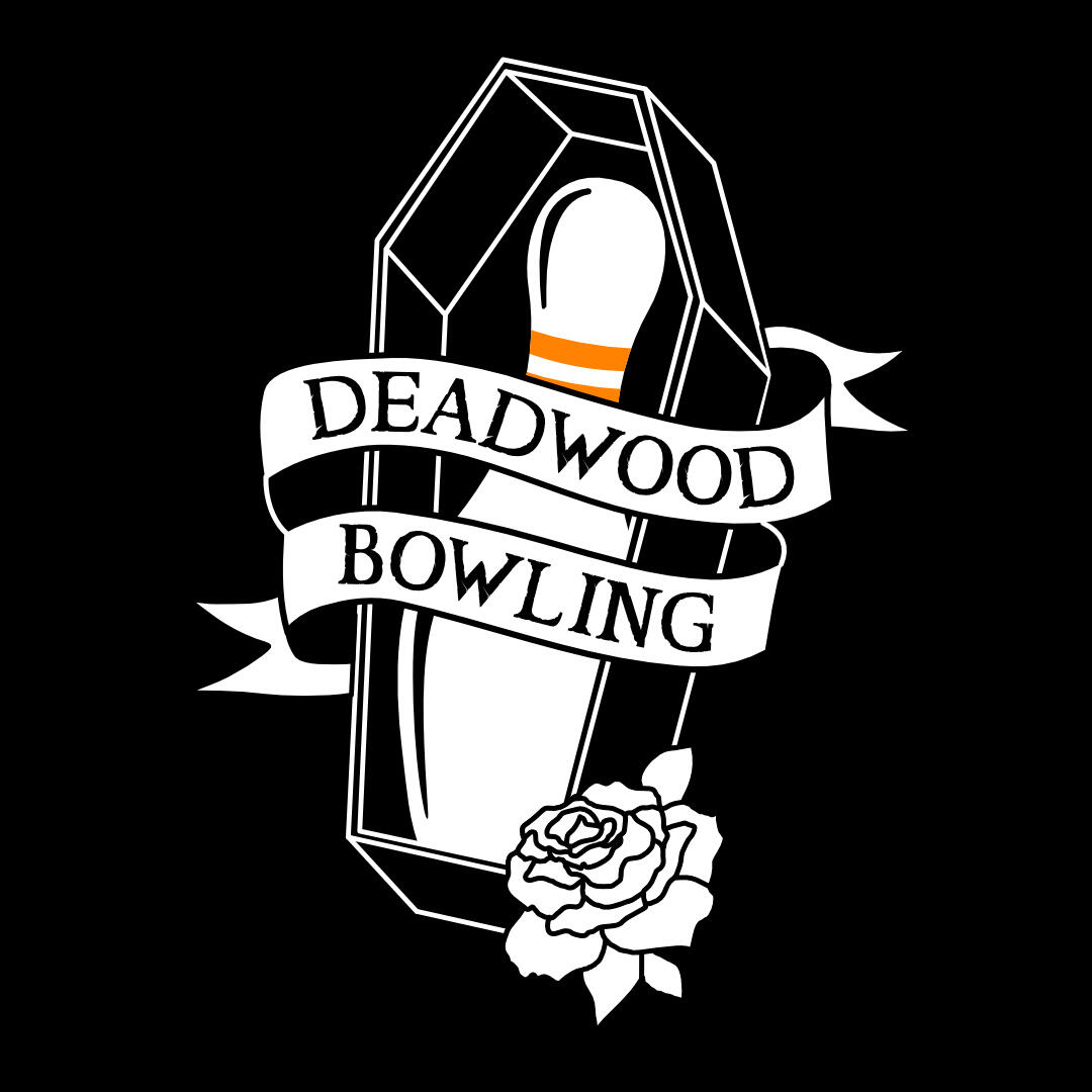
BRANDING
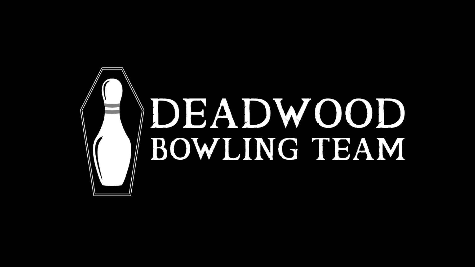
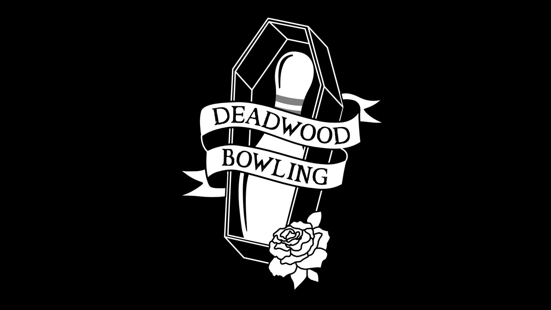
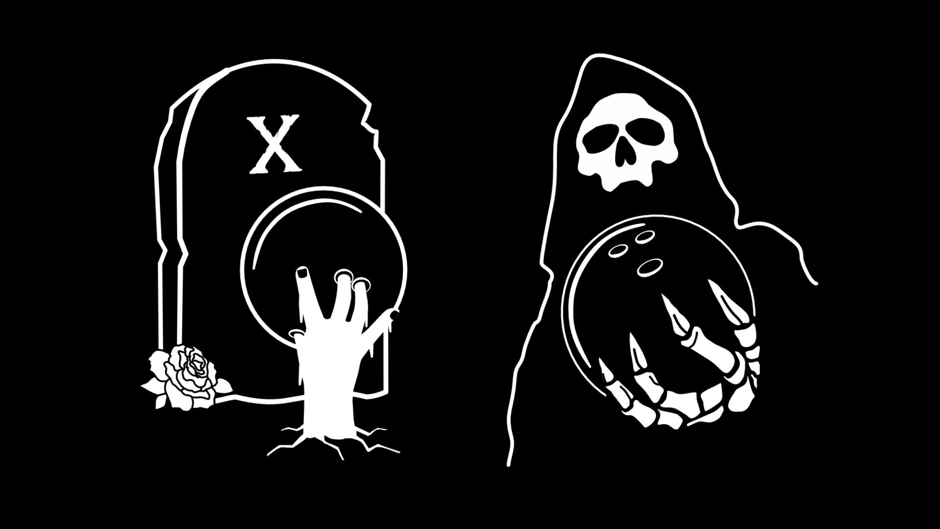
DEADWOOD
Branding, Illustration, Merch
I was inspired by Halloween and a family trip to a local bowling alley, so I decided to create a brand for a fictional bowling team. Once I had decided on the team name, the logo and illustrations followed soon after, and were heavily influenced by skate graphics.I started by sketching out some ideas, and then I drew the final designs on my ipad. I'm really happy with how they turned out, and I think they perfectly capture the spirit of the (made up) team.
MUSIC
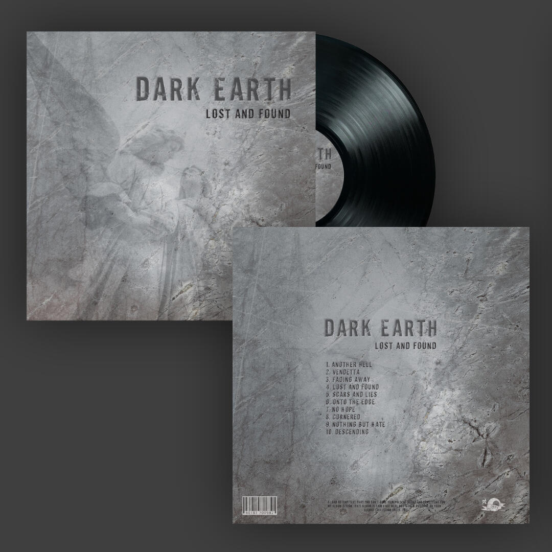
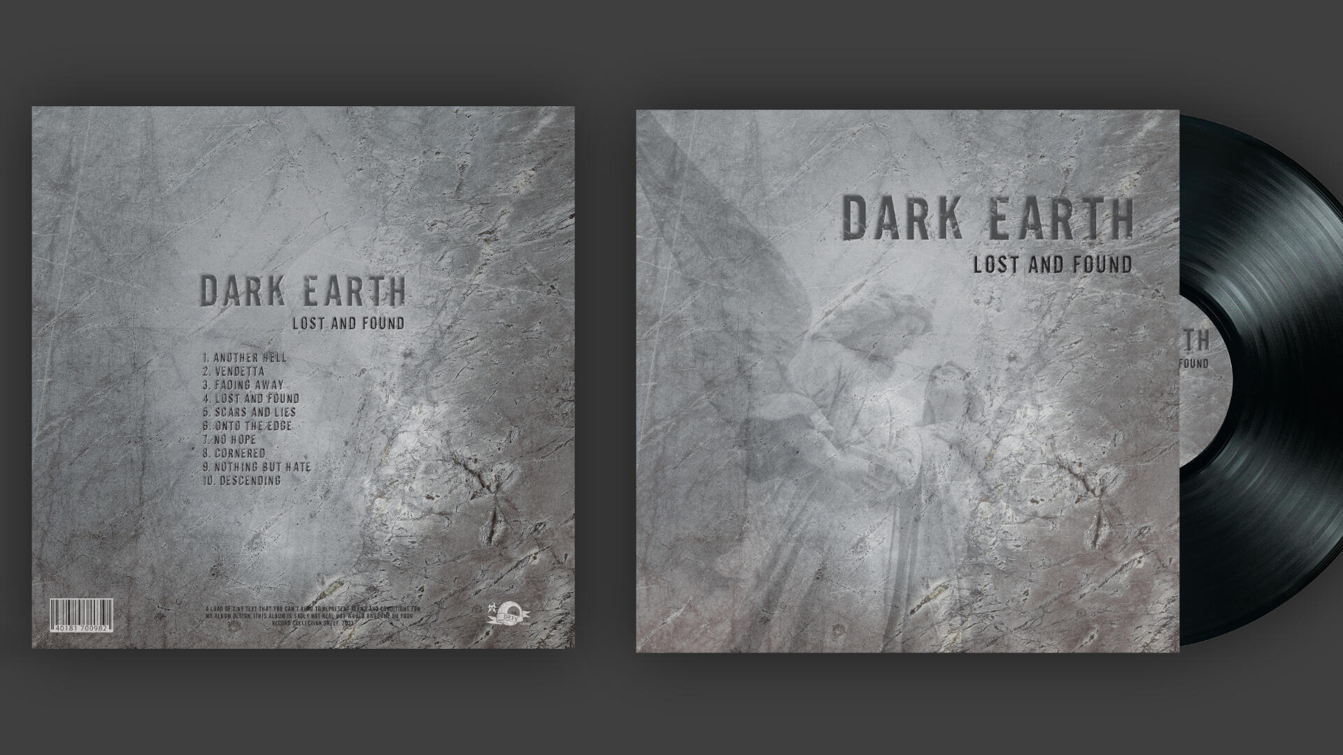
LOST AND FOUND
Graphic Design, Packaging
This EP design was a passion project inspired by Mike D and his work that was on display at the Bloodstock Music Festival. Mike has a unique style blending photography and graphic design, producing some seminal album covers for his band Killswitch Engage, as well as Shadows Fall, Caliban and many more.
CLOTHING
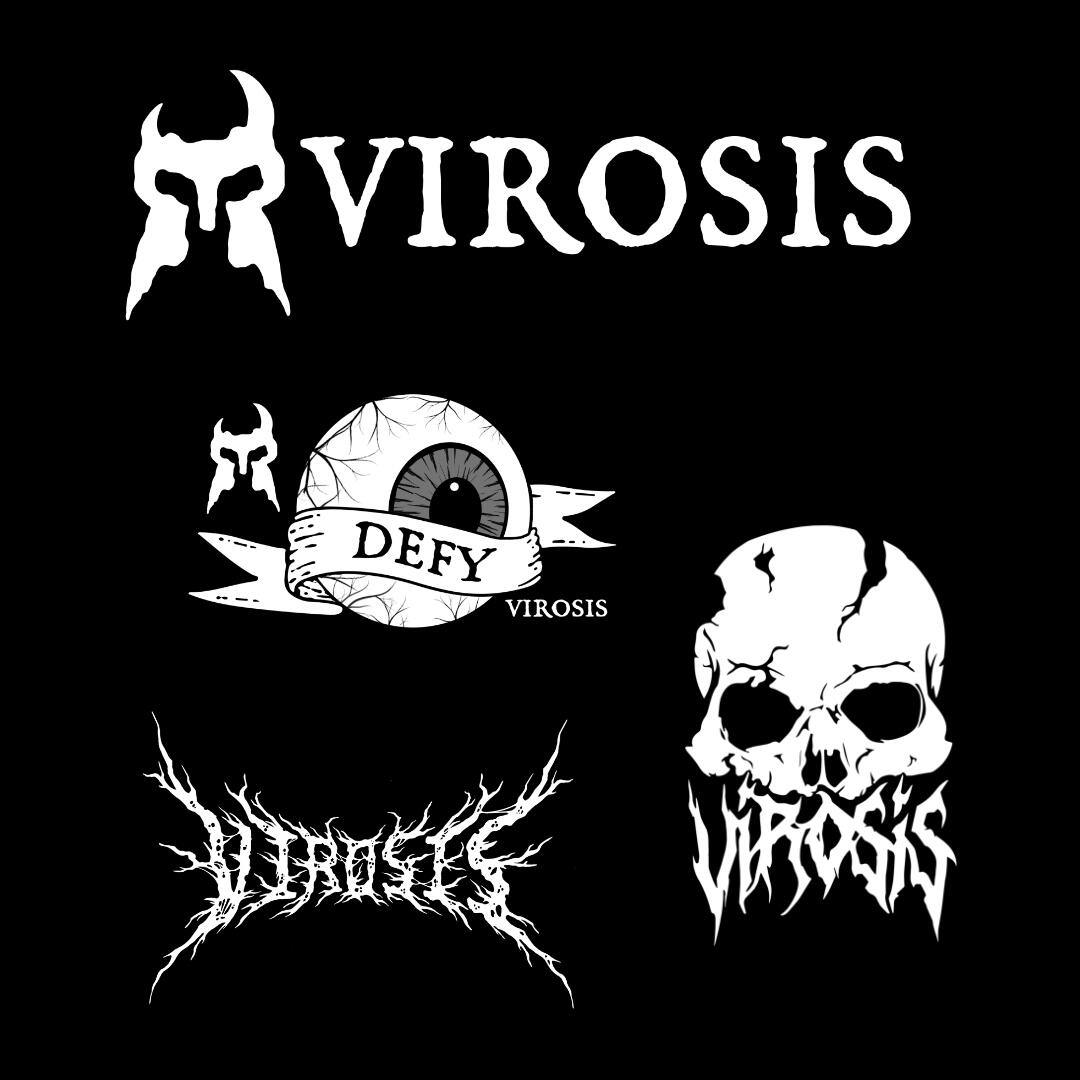
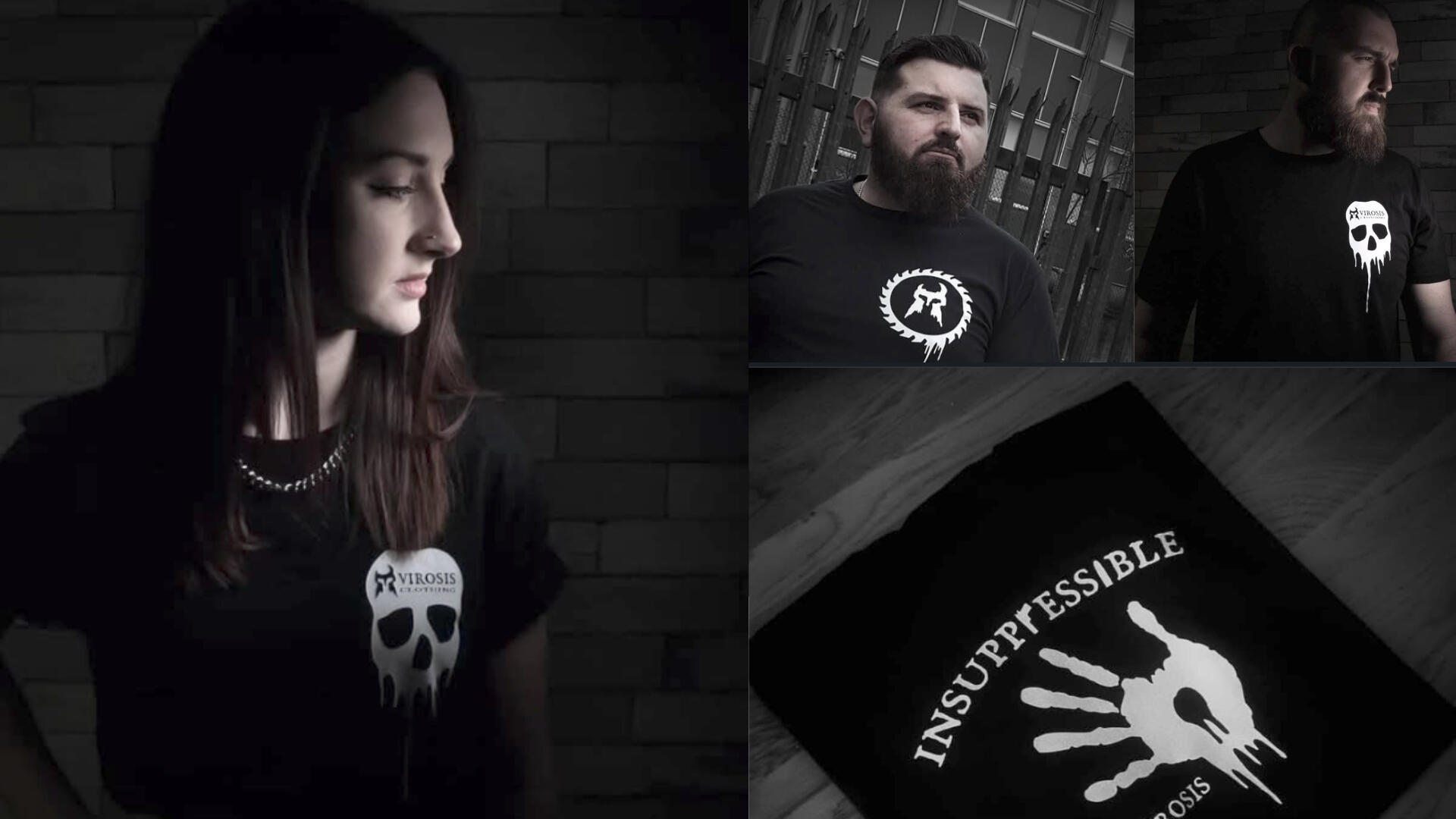
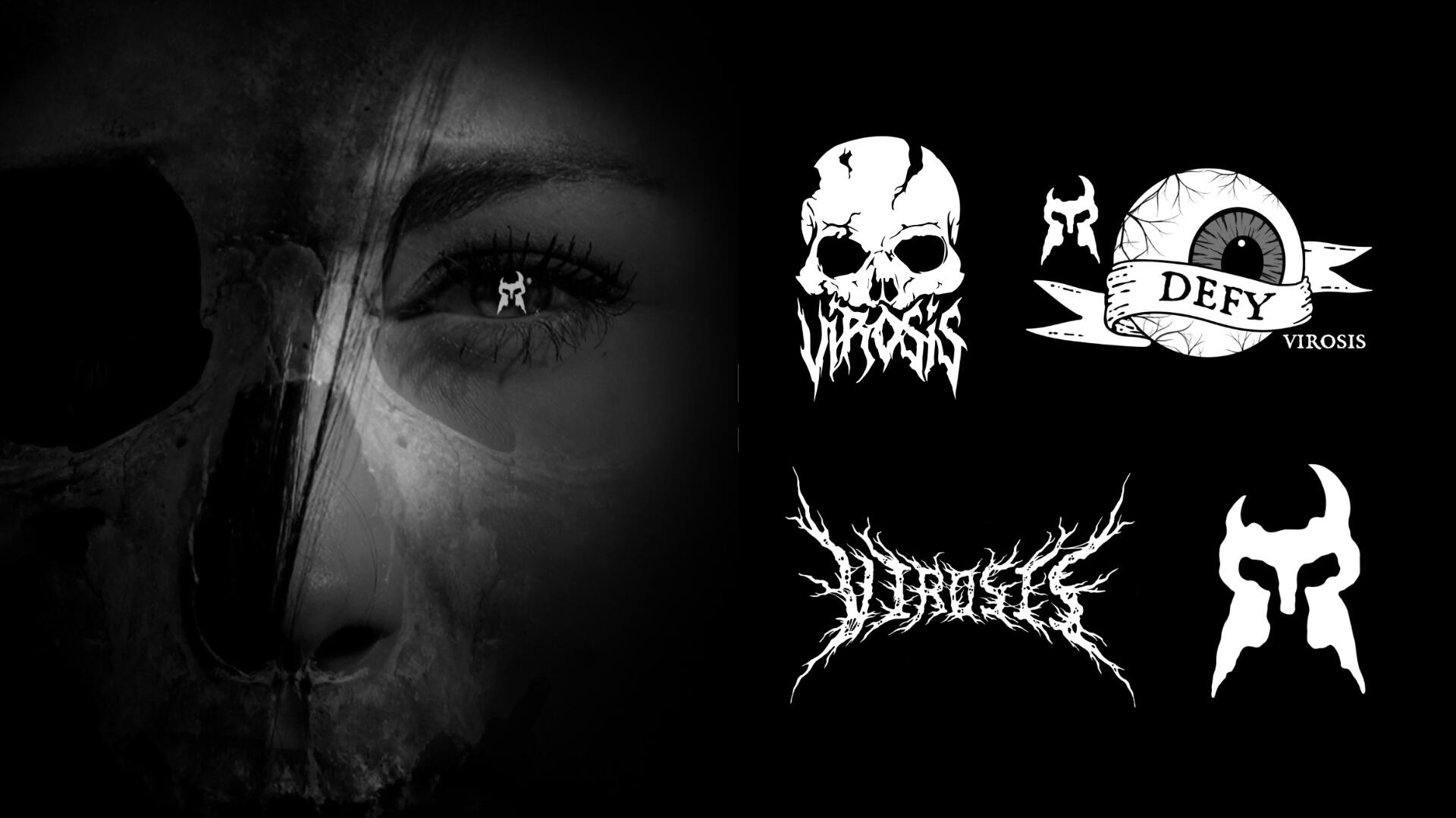
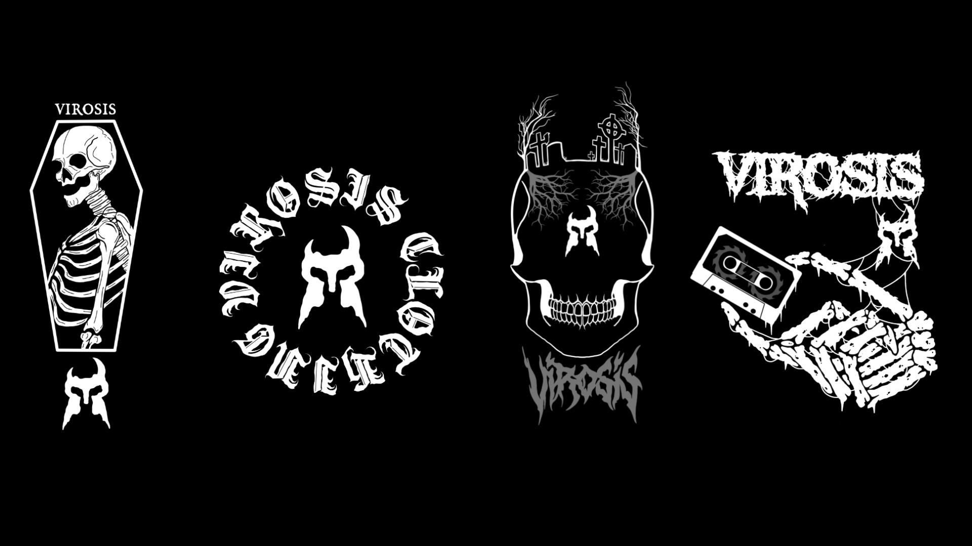
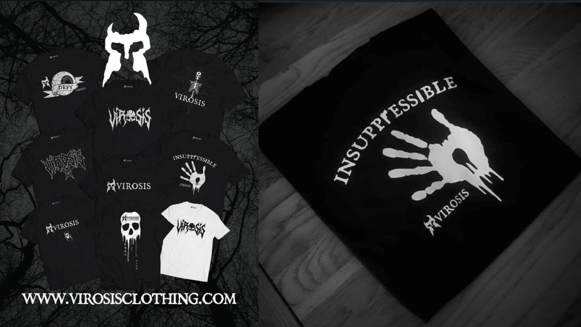
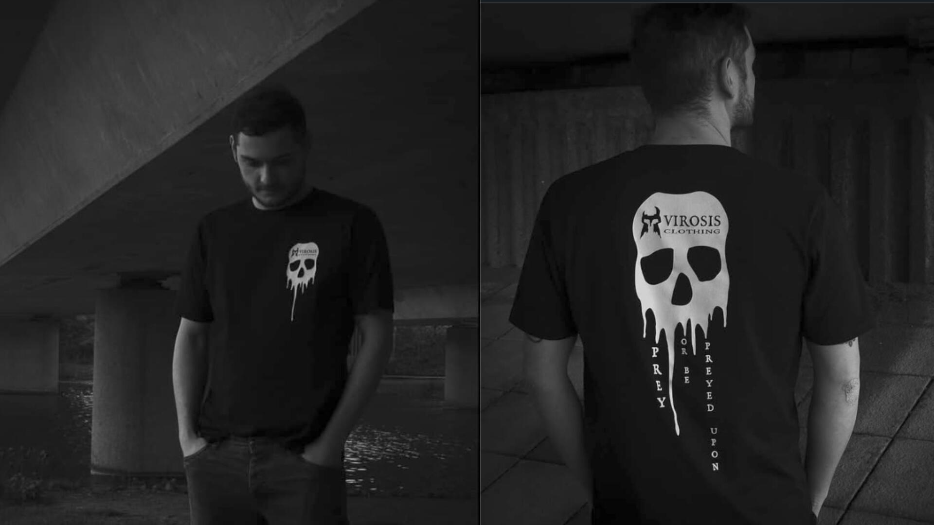
VIROSIS
Branding, Illustration, Social Media
In 2019, I started Virosis Clothing as a way to express myself when I was struggling with my mental health. The name "Virosis" comes from the idea that even from something dark, something new and positive can be created. The logo represents the sometimes difficult fight within yourself to achieve your goals, and the tagline "Emerge Relentless" reinforces this idea to keep pushing through no matter what.Every design and its marketing kept this mantra and used darker imagery and heavier music to promote a positive message. Black and white photography was used at first, but this evolved to use some saturated coloured elements, especially people shots.
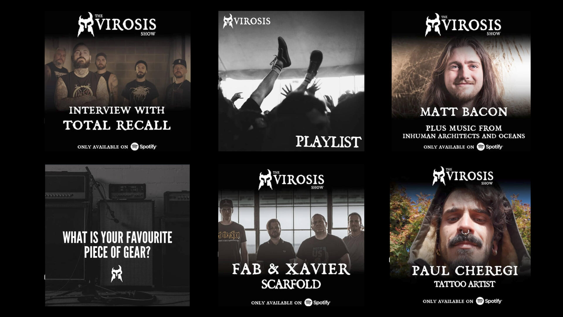
THE VIROSIS SHOW
In order to strengthen the brand's presence, we developed a podcast featuring exclusive behind-the-scenes content, original features, and insightful interviews. The podcast's primary objective was to provide listeners with an engaging and ultimately positive experience. We also teamed up with 1054 Records to showcase their awesome roster of Metal and Hardcore bands.
BOOK
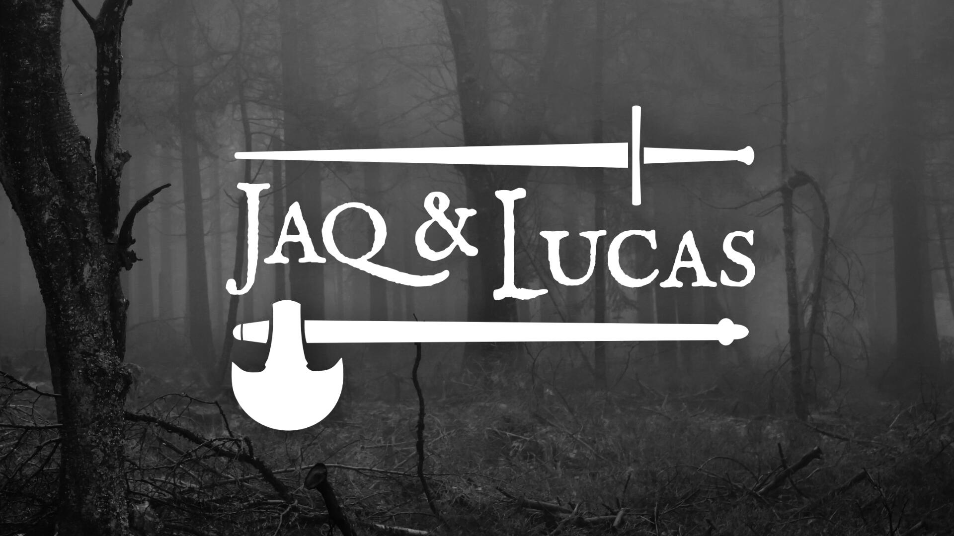
JAQ & LUCAS
Logo Design
I was approached to design a logo for the upcoming Jaq & Lucas book series, which is a fantasy saga about the journey of two warriors with very conflicting backgrounds. Following some great concept discussions, we decided to use their signature weapons in the final design.